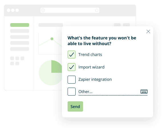
There is a group of surveys that are not sent to respondents, either in the form of an e-mail or a link. We are talking about all types of surveys published directly on a website, displayed, for example, in the form of a pop-up – a window that appears in the center of the screen or is permanently “glued” to the corner of the page. In Startquestion, such questionnaires are called website surveys and may look like this:

As with any other type of survey, the website survey its content, place, and time of publication is largely impacted by the response rate, i.e. how many people will take part in the study.
Based on the experience in conducting research in the form of a widget and the success stories of our clients, we have created a list of practical tips that will help you achieve a high response rate, i.e. encourage people to click on website survey and participate in your research. The article will let you find out:
- what the website survey should look like to encourage users to fill it out,
- what questions to ask in the widget and what to avoid,
- at what moment of the user’s journey and where the website should be displayed, so that the respondent is not irritated and the response rate is not lowered,
- the impact of the gratification on the attendance in the study,
- what should be tested before publishing the survey on the website.
Step 1: Take care of the right context
Think about who you want to direct the survey to and set the appropriate display rules. When conducting a study through Startquestion all you have to do is download and install the code once, and any rules according to which the widget is to appear on the website can then be set from the interface. Depending on the target group and the purpose of the website survey, you can decide that it will be displayed, for example, when the user spends at least X seconds on the website, scrolls a certain percentage of the page, visited at least X of your subpages, or intends to leave the website.
From the user account level in Startquestion, you can easily set capping, which is the number of views of the survey per user. This means that you decide how many times to display the widget to the user on the page in order to effectively encourage them to fill it in.
Tip: it is worth planning the display of the survey in such a way that it appears on those subpages of your website to which users come directly from the search engine.
Step 2: Remember that appearance matters
How the widget looks will have a huge impact on the willingness to take part in the study. Make sure it encourages users to fill it in, rather than annoying them and prompting them to close the page. When planning the appearance of a survey on the website, you focus on the following aspects:
- colours and fonts matching the appearance of the page on which the questionnaire is displayed,
- keeping the same font for all website survey questions,
- consistent formatting (same spacing, question numbering, etc.),
- an orderly and logical structure – one question is to result from the other, the respondent is not surprised by the content of the next question (unless that was the purpose), and at the end there is a ‘thank you’ for filling it in, etc.
Tip: match the colors and design of the survey to the page, but do not make it invisible – make it stand out from the text or offer.
Step 3: Choose a good place to put the survey on the website
Place the widget in a place that will be the most convenient for the user so that clicking on it does not require additional actions, switching to separate pages or using the keyboard. Be sure to also check if the website survey is clearly visible and nothing covers it, e.g. a cookie message, chat or other marketing campaigns.
Tip: Remember to check the correct display of the survey also on mobile devices.
Step 4: Ask short questions and get straight to the point
The key rule: a good survey is a short survey also applies to widgets placed on the website. A study conducted among respondents shows that a short survey has a much greater chance of high attendance – the response rate is 17% lower on average, when it takes the respondent more than 5 minutes to complete.
A website survey is not the place to ask about everything – it should have from one to a maximum of three questions. This rule is especially important when the traffic on the website on which the survey is to be placed is low. Then it is worth considering a scenario in which you will first ask one question with fairly general answers, and only then in subsequent surveys you will ask about the details of the experience. When conducting research on the Startquestion platform, you can easily plan the next editions of research because once installed, the code can then be used to create an unlimited number of surveys.
Compactness applies not only to the entire survey, but also to specific questions – the shorter they are and the fewer answers, the better. It should be remembered that the widget on the website is likely to “disturb” users – it will distract them from the activities they are currently doing. Therefore, it is worth taking care of the valuable time of the respondents and asking simple questions so that they do not have to think about them for a long time.
Tip: When creating a survey, do a simple exercise – write the content of the questions and answers and then try to cut them in half.
At the stage of creation t is also worth to have the results you want to collect in the back of your head. Think about how you want to use them, what do you need this knowledge for and what steps you will take based on it.
What if you plan to conduct a longer study? This does not mean that you should resign from placing the survey on the website. In such situations, we recommend using the widget not to conduct the entire study, but as an invitation. Startquestion makes it possible to implement various types of invitations placed in a pop-up window, iframe or so-called sticky invitation, on your website. After clicking on each of them, the user may be automatically redirected to the rest of the survey.
Step 5: Use the power of the first question
The decision to fill in the questionnaire on the website is made in a split second. Therefore, the first question the user sees is critical when it comes to the success of the survey. It should be structured in a way that encourages users to continue to fill it in, so it should be:
- easy to fill in,
- carefully designed in terms of graphics,
- interesting or closely related to the topic of the next part of the survey.
In addition to the right question to open the website survey, it is also worth paying attention to the order of asking questions. You should start with the questions that are most important to you from a business point of view because research practice shows that it’s the first questions that collect the most answers and there are fewer answers further in the survey. If the questions are not related to each other, it makes sense to apply a random order (option available in the widget settings on the Startquestion account), thanks to which the responses will come proportionally.
Tip: Remember to take care not only of how the survey is displayed on the computer but also on mobile devices.
Step 6: Test, don’t risk
Before the survey appears on the website and is available to all visitors, it is necessary to test it. This is very important because a survey that contains errors or displayed in an inappropriate way may not only result in the users failing to fill it in but also in a failure of future surveys – the user will be discouraged from providing this type of feedback and will have a sense of wasted time.
Ideally, impartial third parties should also be involved in testing, e.g. your co-workers. During the test, first of all pay attention to whether:
- the questions are written in clear, understandable language and do not contain any errors,
- there is no problem with moving to the next questions,
- the logo, graphics or video contained in the study are displayed correctly,
- the survey is clearly visible on the website – it does not blend in with the background or is blocked, for example, by any advertisement,
- the questionnaire is displayed correctly on mobile devices,
Do not run tests at the last minute. It is worth publishing the survey on the website in advance, e.g. if you record the greatest traffic during the weekend, the widget should appear on the website already on Thursday, so that you have the opportunity to validate whether everything is displayed correctly. Proceed in the same ways if you plan, for example, to conduct a competition on the website – implement the survey earlier, in times of weaker traffic and check if the results come in correctly.
Remember: when you test the survey, you’re not risking anything. The widget can be turned on and off from the user panel with one click. So you can install the code on the website well in advance, test its filling in and be sure that no mishaps occur during the test.
Step 7: Offer a reward for completing the website survey
Our observations and many years of practice in conducting research show that the addressee who has been promised a reward for completing the survey decides to participate in the research much more often. Gratification has a positive effect not only on the response rate but also on the quality of the feedback received. If someone knows that a reward will be given to them, they will pay more attention to what and how they write in the survey.
According to Qualtrics research, a reward selected appropriately to a given target group can increase the response rate by up to 48%. This is not surprising – after all, it is a kind of compensation for the time devoted by the respondents.
What rewards can you offer for completing the website survey? Here are some examples:
- discount for purchases in an online shop or in a well-known network, e.g. Empik,
- extension of the account validity in the case of SaaS services, e.g. by one month
- a practical gadget with a company logo, if it is a well-known and respected brand.
Step 8: Plan your survey publication in advance.
The time it takes to implement a survey on the website has a huge impact on the response rate, especially when the researcher wants to collect the results quickly. Then when planning the start date of the study, it is worth relying on the specific data on website traffic that you already have – hours in which you can count on the highest traffic, days of the week with the best conversion, etc. Thanks to this, you will be able to calculate how much time the survey will have to be displayed on the page for in order to achieve a satisfactory number of responses.
Important: in your assumptions, you have to take into account that not every visitor will click on the website survey. The average response rate for online surveys varies from 5 to 30%, depending on the type and length of the survey, however, on-site surveys rarely achieve a response rate above 10%.
And finally: Create a website survey which achieve high response rate
Do you want to create your first website survey? You can do it for free – create an account on Startquestion and test the capabilities of our tool for 14 days.
If you still do not have the survey content ready, we encourage you to use the ready survey examples. Thanks to them, customer or user surveys can be ready for mailing within just minutes. Templates can be freely modified and fully tailored to your needs, the appearance of the page on which they are to be placed, and the characteristics of the study.
If you want to know more about publishing the survey on a website, we have devoted a whole section on how to create and publish widgets in our guide.


