Sometimes the most challenging thing about getting feedback is simply… to get it. Have you ever sent a survey via e-mail or published it on social media and got a very small number of responses? Well, you are not the only one. But luckily, there is another way to ask your customers or users about opinions – a website popup survey.
This short and accessible form of collecting feedback help a lot of companies and organization by providing valuable opinions and suggestions directly on the website. In this article, I’ll focus on survey popups and show you how to conduct website research to achieve a high response rate.
What is a Website Popup Survey?
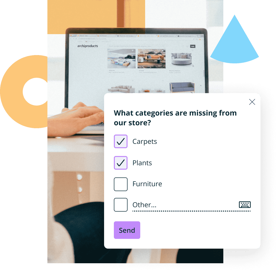
Imagine you are visiting a website, and suddenly in the corner of the screen appears a small square with text: Please share your feedback about this website. This kind of feedback request is a popup survey. You can find many names for this kind of user and customer research: on-site surveys, on-page surveys or survey widgets, widgets on the website, etc. What all popup surveys have in common is their aim: companies and organizations use them to capture insights most simply and effectively, without interrupting the user journey and even if they don’t have any content for the respondent.
To summarize: a website survey is a tool to get fast information about what stops users and website visitors from converting and what customers think about your product.
Are Popup Surveys Effective?
Every tool that helps you better understand your users, customers, or visitors is an asset for your online business. Of course, there are many of them – from survey tools to Google Analytics with many different options like social listening on the way. So why is worth choosing a website popup survey? The main reason is its effectiveness.
Website Popup Survey Response Rate
No matter what you will ask the website visitors, you want them to answer. Otherwise, what is the reason to even ask, right? Popup survey allows you to get a high response rate very quickly. This is a much more effective way of getting a lot of feedback than sending a survey via email or publishing links on social media. There are a few reasons why:
- The average response rate for online surveys varies from 6% to 16%. It depends mainly on the type and length of the survey. The Last Delighted studies showed the lowest response rate we can expect while sending surveys via email (6%). 8% is the average attendance rate for website surveys and 16% for popup surveys in-app.
- The widget on the website has to be concise. The study shows that shorter surveys have a much better chance of a high response rate. If completing the survey takes longer than 5 minutes response rate can be even 17% lower.
- Remember that with a website survey, you can precisely decide when to show visitors a popup. Thanks to this, you can be sure that the survey is not interrupting their actions and therefore is not irritating. It is hard to collect feedback from an angry person, right?
- The number of answers also depends on the topic of the study. Transactional surveys usually have higher response rates than relational ones. Pop-up surveys shouldn’t be used to ask customers about their relations. That’s why they usually have a higher number of completions.
- It is good practice to include only one question on each survey page. The appearance of the website popup survey forces these settings. Thanks to this, the questionnaire is easier and faster to complete, and more people will reach the end of the survey.
Even though the scale presented above may not look spectacular, think about the possible scale of website popup surveys. In one day, even one minute, you can present this popup to thousands of people, and even more when conducting a successful blog or e-commerce website. Taking this into account, you can expect much higher numbers of completions than when you send surveys via email or social media to a much smaller group.
In a separate article, you can find more tips about achieving a high response rate for website popup surveys.
Targeted Website Surveys
One more thing strongly connected to the response rate of website surveys. As we mentioned above, you can expect that around 8% of visitors will complete your popup survey on the website. But you can double and triple (or more!) this number with proper targeting.
The first thing to do is to choose your target audience. Using advanced survey tools like Startquestion, you can adjust any rules according to which the popup survey should be displayed on the website from the interface level. Thanks to this, you can quickly set up rules, thanks to which the widget is presented to the website users. There are a few options to target the audience connected with popup survey display settings:
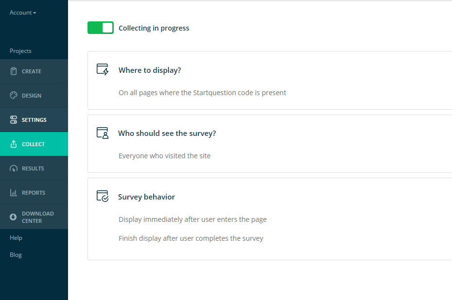
- Where to display – thanks to this option, you can decide if user or customer surveys will be displayed on all pages with the Startquestion code or only on selected pages. It depends on the purpose of your research – if you want to ask questions about a specific page; for example, the category in your e-commerce or payment process, you will choose only those subpages to don’t irritate users with irrelevant questions.
- Who should see survey popups – here, you can decide if the pop-up survey will be visible for all visitors or only chosen one (new visitors, returning visitors, etc.). The display criterion may be a feature or behavior of users, among others: cookie content, previous page URL, or the time on the entire site.
- Survey behavior – you can decide when to start and stop displaying widgets. It’s possible to show a pop-up survey immediately after the visitor enters the website once he or she has spent the current X time (f.ex. 10 seconds after entering) when the user has scrolled the page by X % or pixels.
Considering how a website’s structure can impact user experience, having clarity between domains and subdomains can enhance your overall website strategy. By organizing content with methods such as using subdomains effectively, you avoid unnecessary complexity within site navigation, potentially improving response rates for tools like website popup surveys by making your site’s layout intuitive.
We will advise you to try a few options of targeting for your online survey to see which provides you with the highest response rate and the best quality of feedback. In our User Guide, you can read more about creating popup surveys and displaying them to a proper audience.
What is worth mentioning here, for the pop-up survey to work properly, you have to download and install the code only once. All the above-mentioned settings you are implementing intuitively from the Startquestion user panel, and they automatically appear on your website without any need to involve an IT specialist and change the code.
Website Popup Survey Examples
You can use surveys on the website in many different ways – below, you can find some of the most useful use cases:
Website Feedback Examples
It’s the most obvious, but also the most useful example of a pop-up survey. In a website feedback survey (know also as a website evaluation survey) you simply ask potential customers and visitors to evaluate your web page. The website evaluation survey will help you quickly gather information, even from a large group of respondents, and ask about any potentially problematic issues related to navigating the site. It’s must-have feedback to gather for UX researchers, product owners, designers, etc. Website feedback examples may contain these kinds of questions:
How likely are you to return to this website?
- What features influenced your decision to continue using this website?
- What is it about this site that you would most like to see improved?
- How do you evaluate the various aspects of using the website? (intuitiveness, speed of searching for information, loading speed, general look, content, payment)
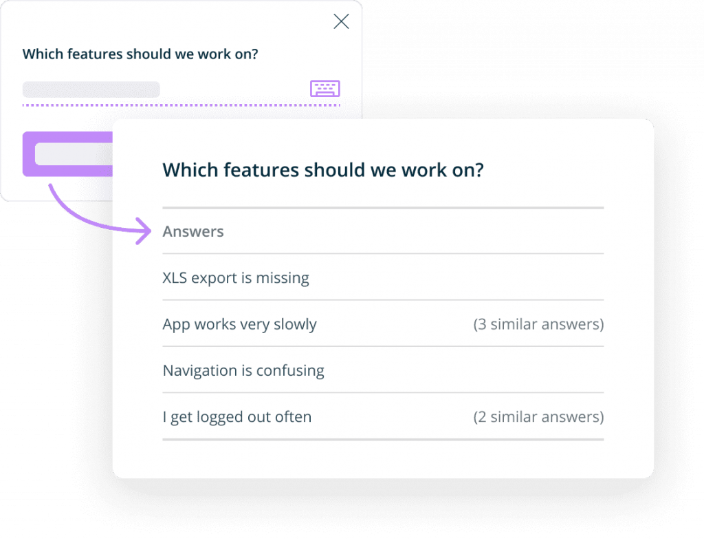
In addition to your overall assessment, you can use surveys to ask more detailed questions about your website, the answers to which are crucial for your business growth and increased revenue. Here are some examples of other site surveys:
- Popup for evaluating website functions
- Evaluation of the article on the blog / in the guide
- Survey about missing website features
- The form for reporting shortages on the website
- Popup for visitors: How did you find us?
Web Demographic Survey Popup
Don’t you have all the information you need to create the best offer for your customers? A web demographic survey popup it’s one of the easiest ways to get them. Thanks to a few simple demographic questions, you can know your users much better. There are a few examples of the questions you can add to your web demographic survey popup:
- What is your gender?
- How old are you?
- What is your marital status?
- Do you have kids? How many?
- In which country were you born?
- How many people, including yourself, live in your household?
The demographic survey can be helpful both in e-commerce stores and online apps. Remember to be careful not to ask too many questions in one popup and not offend your visitors with its content. If you need more private data, which can be considered delicate information (like income, ethnicity, or sexual preferences), ensure respondents that the survey is 100% anonymous.
Website Exit Surveys (Exit-intent Survey)
Why do your customers abandon their purchase or leave the website before using the service? Thanks to the website exit survey getting the answers to these questions could be very simple. The exit-intent survey can be displayed to all visitors exactly when they want to leave your web page without finalizing the purchase. Thanks to this, you will quickly get potential customer feedback and find out:
- Why the user leaves the page?
- Whether the reason for leaving the website is the appearance or intuitiveness of your website?
- How is the website rated?
- What can you do to make your customers complete their purchases in the future and use your services?
There are a few more examples of popup surveys that you can use to get valuable customer feedback. Discover the reason for the low level of order completion with:
- E-commerce Survey: What is Stopping You from Ordering?
- Cart abandonment survey
- Popup with the question: What is stopping you from creating an account?
Website Popup Survey Best Practices
The reason you conduct a survey on the website is probably not just to get user or customer feedback. It’s to gather valuable opinions to help you make good business decisions. Below I prepared a few website survey best practices which will surely help you with achieving this goal and easily create popup surveys:
1. Set a goal for the popup survey
To get valuable insights about your users and customers, before you start your first survey, you have to decide the aim of conducting it. Online surveys allow you to ask many different questions, but the fact that you can ask them doesn’t mean you always should. You have to clearly understand what information you need to make better business decisions.
Here I will present a few examples of goals to set for popup surveys on product pages and e-commerce websites:
- Discovering the intentions of the website visitor
- Discovering reasons for the cart abandonment
- Finding the reason for the low conversion rate for e-commerce payment
- Receipt of the new look of the website/product/function by customers
2. Ask relevant questions
If you know what kind of feedback you need to get, it’s time to think about asking relevant questions. This applies to both the content of the questions and their type. There are a few types of questions that will fit widgets on the website perfectly and will help you to get more answers:
- Single choice questions
- Multiple-choice questions,
- Net Promoter Score question (optionally with NPS-related emoticons)
- Questions about number, date, or e-mail (useful with collecting sign-ups for newsletter or webinar).
If you need more detailed feedback, you can also ask open questions. They are perfect for providing in-depth feedback about your website, product, or customer preferences. However, make sure that you are not adding too many of them because they demand much more time and effort. Therefore, there is a big chance you will get a very low response rate.
3. Make pop-up surveys short and easy to understand
As I mentioned above, a short survey has a much better chance of getting more responses than a long questionnaire. Therefore, when creating content and choosing the type of questions, try to keep them short and easy for everyone to understand. The following tips can help you with this:
- Do not ask for data that can be obtained from other sources (e.g., from Google Analytics, CRM system)
- Do not create complicated questions – instead of one complex question, it is better to ask a few simple ones
- Keep open-ended questions to a minimum
- If the popup survey has more than five questions, better divide the survey into two editions, then there is a chance that more users will finish the survey
3. Design the look to fit the page while being visible
Ensure that the look of your website popup survey encourages users to complete it. It’s much easier to collect feedback using an aesthetic survey than with some annoying popup that doesn’t match the website the visitors are currently on. Below I prepared a few tips that can help you with design during the design process:
- Make sure that the colors and fonts match the website
- Keep the same kind and size of font for all popups which are appearing on the same web page
- Keep consistent formatting
- Create logical structure – it is best to apply the tactic from general to specific, and one question should flow from the other.
On our website, you can see a few popup survey design examples.
4. Test the popup before showing it to a larger group of visitors
What if your widget inappropriately contains errors or displays? Well, it may not stop visitors from completing it, but it also makes you a bad PR and discourage users from providing this type of feedback in the future. That’s why you must do some tests before any pop-up survey appears on your website.
How to conduct the test? It’s easy – ideally, you should involve an impartial third party, e.g., your co-workers or employees. During the test, you have to check if the following:
- The questions are easy to understand for any visitor and don’t contain any grammar or orthographic errors
- All the pictures and videos are displayed correctly
- There is no problem with moving to the following questions
- The visitor can easily spot the popup on the website – it does not blend in with the background or is blocked by any ads
- The surveys are displayed correctly on mobile devices
How to Add a Pop-up Survey to Your Website
Popup widget is one of the least complicated types of surveys in terms of installation and first run. The best way to put a popup survey on a website is to use one of the professional tools, like Startquestion. Below I will show you how fast and easily you can put feedback forms on your website and start to collect feedback or measure customer satisfaction.
Step 1: After logging in to the Starquestion user account, click the Create project button, select the Feedback Pop-up option, and enter your widget title (f.ex. Customer Satisfaction).
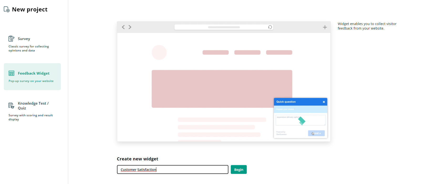
If you decide to use one of the popup survey examples available on our website after clicking Use this template button, it will be automatically copied to your account.
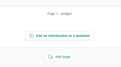
Step 2: When you create the project, you will get access to the survey creation panel. After clicking the: Add an introduction or a question button, you can create content for your website popup surveys.
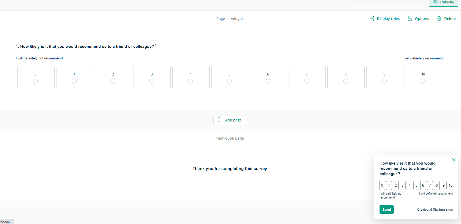
By adding the first question, your project is automatically created, and if you decide to ask the Net Promoter Score question, it may look like this:
Step 3: When the content on your website widget is ready, it’s time to activate it. First you have to do is enable the collection of the results, which you can do by going to the Collect tab and clicking on the Activate Collecting button
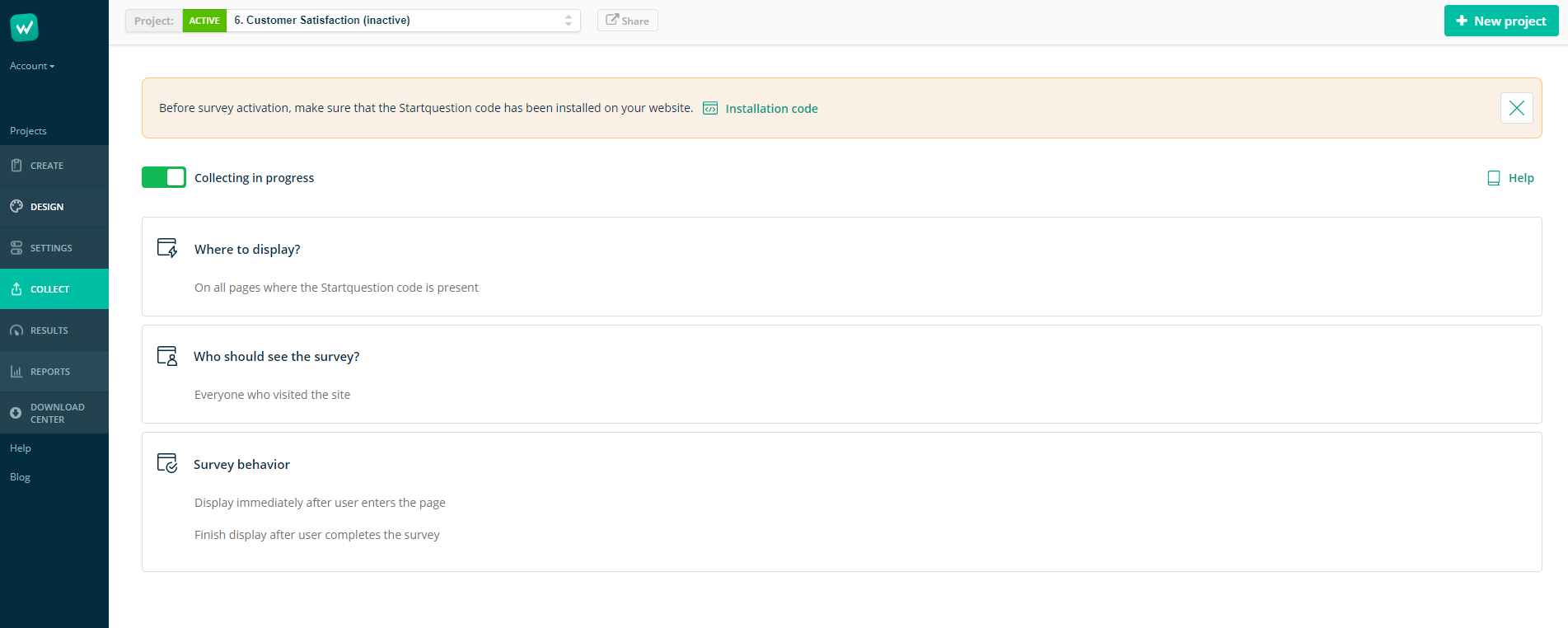
Then you can start to set up display rules for your widget, which I explained above in the section about targeting options.
Step 4: When all the settings are done, you must consider installing the code on the website. To do it, go to the Account tab, Settings, and Widget code.
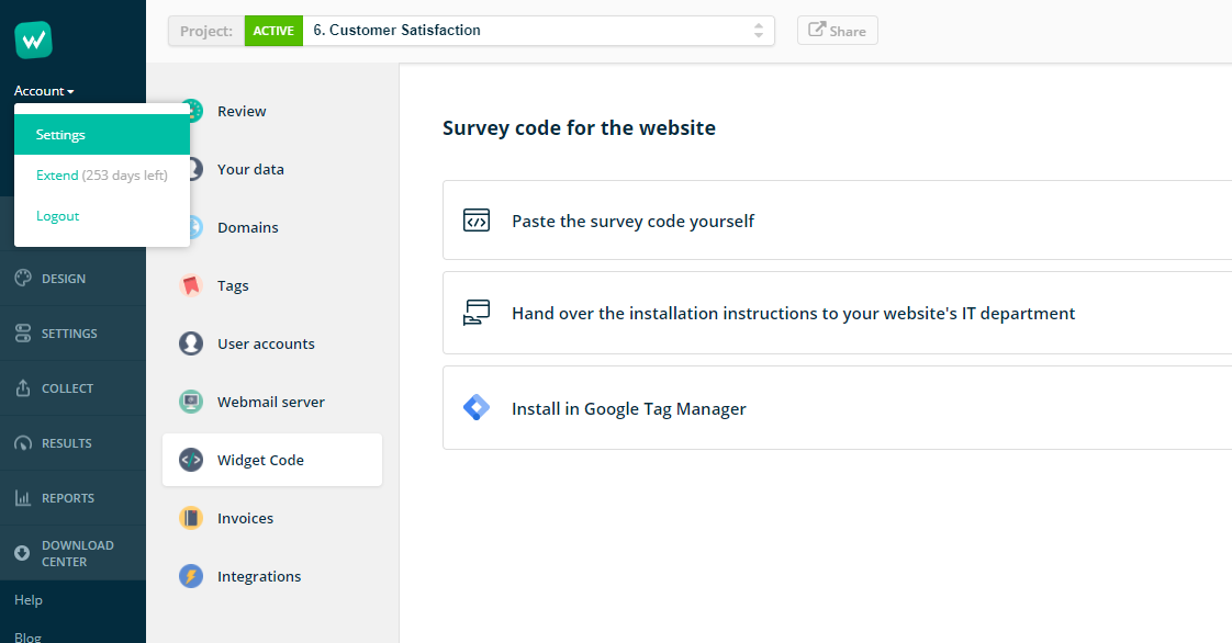
There you can see 3 options for installing the popup code on the website – the standalone installation, commissioning the installation to your IT department with a ready-made message, and an installation via the Google Tag Manager. Choose the one that fits you best, and… it’s done.
Remember that you have to go through this installation only once, and later you can manage your popups (add new website surveys, change the content, or display rules) from the level of the Startquestion interface, without involving IT.
How to Analyze Website Popup Survey Data
Analyzing the popup survey results should always correspond to the goal you set at the beginning. However, some general guidelines can help you get the most benefit out of collected data:
- Don’t wait with analyzing – getting around 100-200 answers it’s usually enough to start to make some valuable conclusions,
- If you lack information, write down the deficiencies and conduct another survey. Better to ask than to guess.
- Simplify your work by using advanced features to analyze the results. On the Startquestion survey tool, you can filter the results (e.g., the division into user categories), create cross tables (in search of dependencies), observe trends (see how user opinions change over time) and rankings (quickly conclude, e.g., about the popularity of functions or products in the e-commerce store).
- Turn the feedback into hypotheses and conclude. This will be a solid base for business solutions and decisions.
- If it’s possible, integrate collected data with your CRM or analytical tools that your team is using (Google Analytics, Amplitude). This will increase the likelihood that more employees in the organization will know and act upon the results in their daily duties.
To sum up: the most important rule is to act upon collected feedback. Popup website surveys make collecting feedback quick so that you can learn about your users, visitors, and customers. But collecting and even analyzing is not enough – the key is to use all those data to introduce valuable changes to the websites, products, or business plan and create an efficient marketing strategy.
